Visualizing Environmental Data
A new generation of data visualizations and sonifications are being developed by teams of environmental scientists, computer programmers, and artists to convey environmental information in new ways. These visualizations and sonifications go “beyond charts and graphs” in interpreting data using science, art and music. Below are several sites that use cutting edge web technologies combined with scientific data to produce visual and acoustical interpretations of environmental data. What makes these sites exceptional is that they, like WaterViz, are live-streaming representations of real-time data.

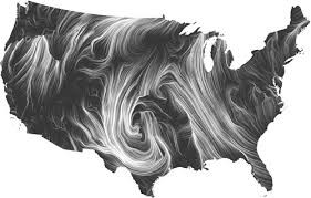
Wind Map
Simply called ‘Wind Map’, this live visualization of wind information for the continental United States is truly mesmerizing. The data for the visualization are updated hourly from the National Weather Service’s forecast database, and provide a hypnotic and intuitive overview of real-time and current wind speeds and directions across the country. Additional clips for extreme wind days are archived in the moving-image gallery.
The Wind Map was created by Fernanda Viégas and Martin Wattenberg, the co-leaders of Google’s “Big Picture” visualization research group in Cambridge, Mass.

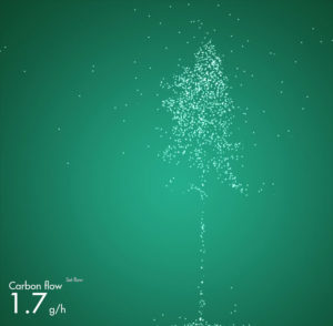
Carbon Tree
The Finnish Carbon Tree is a live data visualization of the complete carbon cycle for a forest in Finland. It epitomizes Scandinavian design simplicity in the elegant portrayal of carbon slowly moving into and out of a silhouetted virtual tree. The site provides additional content and ‘quizzes’ for students and teachers. The site was designed and created by a team of scientists, artists, and graphic designers. The Carbon Tree is the starting point for a new suite of interactive animation tools envisioned by the Climate Whirl concept.

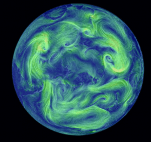
EARTH
A visualization of global weather conditions
forecast by supercomputers updated every three hours. Interactive display also shows ocean conditions, atmospheric chemistry, and aurora.
